We’ve had over a year to think about how “Responsive web design” affects us. The relatively straightforward techniques described in Ethan Marcotte’s book and A List Apart article won’t be covered in this session.
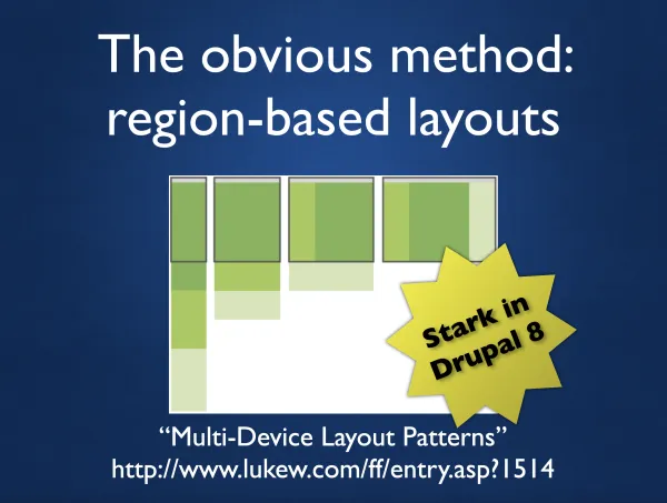
Instead, we’ll think about the limitations we’ve placed on ourselves with our current building techniques and how to break free from them. Break free from regions. Break free from CSS limitations. Break free from the difficulties inherit in responsive design.
In this session, I'll describe practical implementation techniques for responsive design using CSS (or Sass/Compass) and Drupal themes and modules, including Zen, Fences, Field Collection, Panels, Chaos Tools and Display Suite to name…erm… quite a few.
We’ll cover these topics:
- Building techniques for responsive layouts:
- Content first (aka Mobile First, aka Semantic HTML source order)
- The Adjacent Sibling Rule
- The Opposing Float
- The Lasso
- The Corset Variant
- The Absolute Exception
- The Violator
- Gutters with media queries
- Responsive background images
- How to deliver responsive images to different device sizes
- How to integrate media queries with your Drupal theme and modules without making the CSS Cascade insane or killing performance
- How not to pick breakpoints
- Improving front-end performance by configuring lean, semantic markup with Fences
- How to make your main content be responsive with Page Manager
- How to test your design on mobile browsers