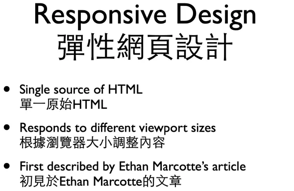
Responsive design is about to take over how all websites will be built. Learn about how to create websites that respond to all screen sizes in a way that is much simpler to implement than traditional mobile website.
Drupal front-end evangelist